Starting the Design
Paper Wireframes | Digital Wireframes | Low-fidelity Prototype | Usability Studies
Sitemap
We determined that a hierarchical website structure was best suited for the sales platform.
Paper Wireframes
I used pen and paper for the first iteration of wireframes to quickly draft each screen of the main user journey in the app to ensure an efficient process. I prioritized ease of access and straightforward navigation for user.
Pen and paper were used again for the initial mobile site designs. This allowed us to quickly come up with ideas for how to layout the same amount of information in a much smaller space.
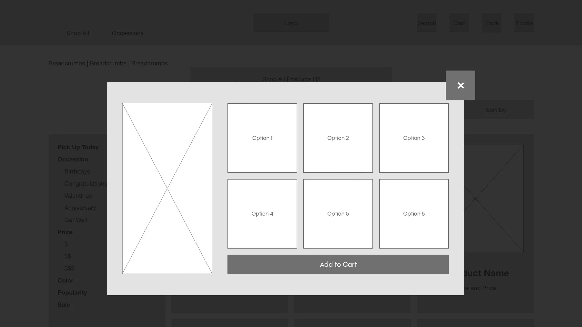
Digital Wireframes
As the process continued, I developed and refined digital wireframes based on the feedback and findings of the user research.
Desktop


Mobile
The mobile versions of the GardenVariety wireframes offer a vertically stacked, scroll-able version of the desktop homepage. Using a vertical layout allowed us to have a fully functioning mobile site without sacrificing any information
Maintaining functionality and ensuring visibility for each component took precedence when deciding how to lay out the mobile site. The quick add feature, and the product descriptions are still available for the customers’ convenience, and on the product details page, the product options are split into two columns for ease of use as well as maintaining a button size that does not lose legibility.


Low-fidelity Prototype
The low-fidelity prototype provides a user flow from the homepage through a successful purchase and time scheduling, so the prototype could be used in a usability study with users.
Usability Study Findings
I conducted two rounds of usability studies. The first round findings informed the designs from wireframes to mockups. The second round used a high-fidelity prototype and revealed what design aspects needed refining.
Round 1 Findings
Users want options that fit their schedule
Users want straightforward product navigation
Users want quality assurance
Round 2 Findings
Some navigation cues are not as clear as they could be
Users expect to have items added to cart rather than navigate to checkout page